
My three Blue Hawk books – SAVAGE HORIZONS, FRONTIER FIRES and DESTINY’S DAWN. There have been several versions of these covers, but the original covers were the best. I also liked the reissued covers that had a couple on them (a bit sexier - by Hot Damn Designs) came very close to my hero, Caleb Sax, and the heroine, Sarah.


MONTANA WOMAN (Bantam Books) – the original cover was a good depiction of heroine Joline and the man she fell in love with, Clint.

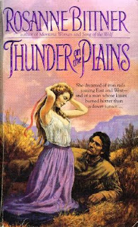
Again, the original cover for THUNDER ON THE PLAINS (Bantam Books) was a good depiction of Sunny Landers and Colt Travis; and the original cover for IN THE SHADOW OF THE MOUNTAINS correctly depicted Irene Kirkland and her Mexican lover, Ramon.


The point of this blog is how we visualize the hero and heroine in our stories vs. how they turn out on the book cover. My #1 complaint with publishers is that they don’t seem to understand the look of a true Native American - or the look of a really masculine, rugged, shaggy-haired, rough and tumble western hero with meat on his bones. Too often, he is nowhere near as big and tall and rugged as I see him in my story.
I swear, those designing today’s covers are too young to be able to envision what pioneers and “real” men, as well as strong, determined women looked like. Too often the hero on a suggested cover is too thin, too short, has too modern and perfect a haircut, and is just too “today” overall.
I want a REAL MAN on my cover – meaty, square jaw, a shadow beard, shaggy hair that he probably awkwardly cut himself, full lips, big hands, etc. 99% of the time that first suggested cover has a man on it who is nothing like I pictured my hero. I am always having to ask the publisher to please make him more rugged, taller, bigger all over, give him messy, shaggy hair, etc. I don’t want someone on my cover who looks like he eats nothing but carrots and spinach and is afraid to get his fingernails dirty. I also don’t want someone who looks like a kid who’s been dressed up by a designer to “look” like a cowboy but who very obviously is NOT!
And please, is there no one in NYC who knows what a REAL INDIAN looks like? In the 80’s Native American men on book covers were nothing more than white men with feathers in their hair. I know there are N.A. actors, but apparently very few who will model for a book cover. It’s too bad there aren’t more, but surely there are ways to put a real, genuine Native American on a book cover, or at least a white man who has very Indian features, not someone with blond hair and blue eyes! Yes, that has happened to me.
Either way, when you spend weeks, months, even years with a certain character or characters (sometimes we let certain ideas simmer that long in the depths of our minds), we writers have a very definite idea of how our characters’ features. Naturally, the publishers can’t read our minds. Neither can independent designers who create covers for indie writers. But we have a certain vision of him or her, and when the cover is designed, it is our dream that the characters look exactly the way we picture them. That’s impossible, and it’s frustrating for us. Usually, if the publisher at least comes close, I accept the cover and don’t complain, but it is still disappointing.
My salvation is hoping my readers do what I do when I read a book. I picture the hero/heroine a certain way no matter who is on the cover. Sometimes I think to myself that the cover picture doesn’t fit how I see the characters, so I just don’t let it bother me. When I am writing, I actually scan through pictures of models on the internet and pick out the ones who look very much like how I see my characters. That really helps in how I describe them. I keep that picture for inspiration and hang it or set it right by my computer as I write. I love doing that, and I love showing those pictures to my readers on Facebook. It gets them all excited to read the story!
Overall, I’ve been lucky with covers, but I still have trouble with publishers properly depicting the hero. Inevitably, I have to send back a proposed cover and ask them to “make him taller” – “make him bigger overall” – “make his hair longer – or darker – or make his skin darker.” Too often the hero comes through as hardly any taller than the heroine, his legs and arms too short, his attire all wrong. And if he’s Native American – same thing – muscular, dark, and if possible, a REAL INDIAN – not a dressed-up white man! Leave his hair long and loose. Make him powerful and give him a slightly mean look – the look of a WARRIOR, not some woman’s patsy.
Just thought I’d share. I do like the new cover for my up-coming western romance, LOGAN’S LADY (March 2019), but I had to ask them to make his hair a bit longer. His haircut was far too short and “tidy.” Even so, it is still not nearly long enough for my liking, but it truly is a beautiful cover, and when it comes to marketing a book, Sourcebooks knows better I what will sell, so I leave some of my complaints to myself. I mainly look for features I talk about in the story to make sure the couple on the cover at least comes close to how I describe them in the book. Sourcebooks is wonderful about listening to my suggestions, and LOGAN’S LADY is a very eye-catching cover showing both movement and romance.
One of the most common questions I get from readers is, “Who designs your covers?” 99% of the time the publisher creates the cover, but I have no idea exactly who does the designing or who was used for models. The only designer I can usually always recognize is Jon Paul, because his covers are so sweeping and unique, true 80’s style romance covers. I do have a say in the design as far as describing the characters for them, and I can ask for certain changes once I see the cover.
When it comes down to it, all I can truly control is the story itself, but it’s hard to live with characters so intimately and then get a cover that doesn’t come close to what I had pictured throughout the story. Thank God, so far I have had good luck with publishers listening to my suggestions and complaints, so that we end up with a happy medium – a great story and a great cover!

Again, the original cover for THUNDER ON THE PLAINS (Bantam Books) was a good depiction of Sunny Landers and Colt Travis; and the original cover for IN THE SHADOW OF THE MOUNTAINS correctly depicted Irene Kirkland and her Mexican lover, Ramon.


The Native American couple on my three Mystic Indian original covers – MYSTIC DREAMERS, MYSTIC VISIONS, MYSTIC WARRIORS – were also well done. The artist did a good job of matching how I saw those characters. (Covers by Tor/Forge Publishing).


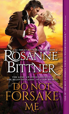
My favorite covers of all are my Outlaw books and the handsome Jake Harkner and his wife Miranda. These covers were fantastic and so eye-catching, thanks to the great Jon Paul, who is almost always spot-on and uses such beautiful and handsome models. The poses and the sweeping background seem to perfectly depict the powerful passion and romance that take place in the stories, and my favorite cover of the four is the one for DO NOT FORSAKE ME. Sometimes I just sit and stare at that cover and remember my Jake.


I swear, those designing today’s covers are too young to be able to envision what pioneers and “real” men, as well as strong, determined women looked like. Too often the hero on a suggested cover is too thin, too short, has too modern and perfect a haircut, and is just too “today” overall.
I want a REAL MAN on my cover – meaty, square jaw, a shadow beard, shaggy hair that he probably awkwardly cut himself, full lips, big hands, etc. 99% of the time that first suggested cover has a man on it who is nothing like I pictured my hero. I am always having to ask the publisher to please make him more rugged, taller, bigger all over, give him messy, shaggy hair, etc. I don’t want someone on my cover who looks like he eats nothing but carrots and spinach and is afraid to get his fingernails dirty. I also don’t want someone who looks like a kid who’s been dressed up by a designer to “look” like a cowboy but who very obviously is NOT!
And please, is there no one in NYC who knows what a REAL INDIAN looks like? In the 80’s Native American men on book covers were nothing more than white men with feathers in their hair. I know there are N.A. actors, but apparently very few who will model for a book cover. It’s too bad there aren’t more, but surely there are ways to put a real, genuine Native American on a book cover, or at least a white man who has very Indian features, not someone with blond hair and blue eyes! Yes, that has happened to me.
Either way, when you spend weeks, months, even years with a certain character or characters (sometimes we let certain ideas simmer that long in the depths of our minds), we writers have a very definite idea of how our characters’ features. Naturally, the publishers can’t read our minds. Neither can independent designers who create covers for indie writers. But we have a certain vision of him or her, and when the cover is designed, it is our dream that the characters look exactly the way we picture them. That’s impossible, and it’s frustrating for us. Usually, if the publisher at least comes close, I accept the cover and don’t complain, but it is still disappointing.
My salvation is hoping my readers do what I do when I read a book. I picture the hero/heroine a certain way no matter who is on the cover. Sometimes I think to myself that the cover picture doesn’t fit how I see the characters, so I just don’t let it bother me. When I am writing, I actually scan through pictures of models on the internet and pick out the ones who look very much like how I see my characters. That really helps in how I describe them. I keep that picture for inspiration and hang it or set it right by my computer as I write. I love doing that, and I love showing those pictures to my readers on Facebook. It gets them all excited to read the story!
Overall, I’ve been lucky with covers, but I still have trouble with publishers properly depicting the hero. Inevitably, I have to send back a proposed cover and ask them to “make him taller” – “make him bigger overall” – “make his hair longer – or darker – or make his skin darker.” Too often the hero comes through as hardly any taller than the heroine, his legs and arms too short, his attire all wrong. And if he’s Native American – same thing – muscular, dark, and if possible, a REAL INDIAN – not a dressed-up white man! Leave his hair long and loose. Make him powerful and give him a slightly mean look – the look of a WARRIOR, not some woman’s patsy.
Just thought I’d share. I do like the new cover for my up-coming western romance, LOGAN’S LADY (March 2019), but I had to ask them to make his hair a bit longer. His haircut was far too short and “tidy.” Even so, it is still not nearly long enough for my liking, but it truly is a beautiful cover, and when it comes to marketing a book, Sourcebooks knows better I what will sell, so I leave some of my complaints to myself. I mainly look for features I talk about in the story to make sure the couple on the cover at least comes close to how I describe them in the book. Sourcebooks is wonderful about listening to my suggestions, and LOGAN’S LADY is a very eye-catching cover showing both movement and romance.
One of the most common questions I get from readers is, “Who designs your covers?” 99% of the time the publisher creates the cover, but I have no idea exactly who does the designing or who was used for models. The only designer I can usually always recognize is Jon Paul, because his covers are so sweeping and unique, true 80’s style romance covers. I do have a say in the design as far as describing the characters for them, and I can ask for certain changes once I see the cover.
When it comes down to it, all I can truly control is the story itself, but it’s hard to live with characters so intimately and then get a cover that doesn’t come close to what I had pictured throughout the story. Thank God, so far I have had good luck with publishers listening to my suggestions and complaints, so that we end up with a happy medium – a great story and a great cover!


0 comments:
Post a Comment